January 3, 2022
"The Map of History"
A map that shows the abundance of recorded civilization
The image
What is this?
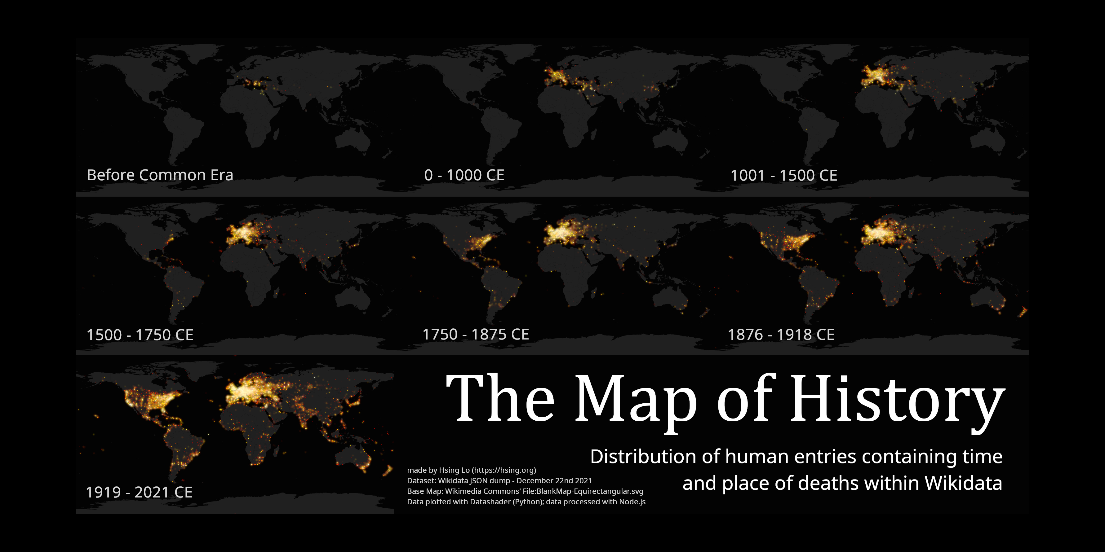
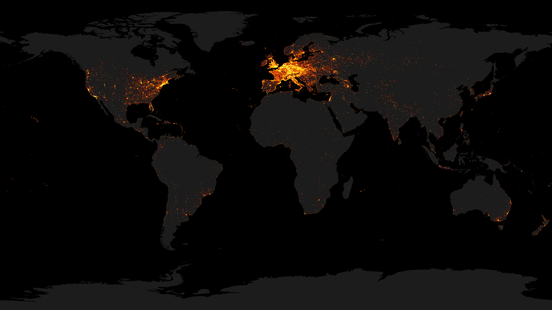
"The Map of History" is a map that aims to shows where history is recorded in detail throughout time
intervals within recorded history. It aims to show when, where, and how much something is recorded from a given
place and era; it also shows how much records have survived. The map only visualizes the quantitative side of
records, or metadata, and not how important or impactful records or civilization are. Again, it also shows how
much of the records survived.
The fact that I am dictating an interpretation of the map might limit what perspective it can be viewed from. I
will explain what it is I am plotting in below sections; other, more interesting, interpretations can be made
Why I made it
This project, for me, is more of a programming-related one rather than one orientated to history, so excuse me if
some histotical-related things are not well done. This project is to get me some experience with big data
(although it is really not that big); the map itself is also personally pretty interesting for me, hopefully it
will be for you too.
How I made it
The core of this project, the data that is being plotted, is sourced from Wikidata. If you don't know what that is, wikidata is basically a database
where things (anything from people to species to works of art, and much more) are cataloged and described. Other
Wikimedia Foundation sites like Wikipedia relies on Wikidata for the more data-orienated aspects.
More specifically, the map plots the time and place of deaths of Wikidata entries tagged as human. There are lots of reasons why I choose to
plot this property, but it mainly boils down to the fact that if deaths are recorded and are in this databse,
they are relatively important and that entries of human deaths are relatively abundant in the database and
they're relatively easy to organize. And the reason that they're choosen over births is that human deaths are
recorded when something is accomplished while, in the same case, the accurate time of births might be unknown
and such.
The fine technical details of how and what I specifically used to process the data and make the maps can be found
in this markdown
file in the GitHub repo where I also posted the scripts used to do such tasks. But in summary, I
downloaded the entire Wikidata database dump and processed it with the scripts, then plotted it.
Out of about 96,400,000 entities
stored in Wikidata, about 9,500,000 entries are humans, and about 1,146,000 of them has the data I am
looking for (time and place of death). The place of death is then dereferenced and a little more than 1,137,000
entries are plottable. Most of them are relatively recent.
Just as a reference, I used the JSON dump of December 22nd, 2021 for all
of this project
I will go into detail of the tools I used in the next section (it is also mentioned in the GitHub MD), but in a
nutshell, the filtering is done with Node.js and the plotting is done with Datashader using Python.
Resources that helped me or inspired me
Tools used
- Obviously the most important resource that was used was the Wikidata database. I would like to thank the countless volunteer that
contributed to the database and making all the knowledge free and public domain
- I would mention the programming tools I used in the creation of this project. Node.js for the filtering of data, and Datashader for the plotting of the large dataset. The countless tools
that was used to build those tools itself is also worth mentioning.
- The map I used as a base is also something really important. It can be found as: File:BlankMap-Equirectangular.svg
on Wikimedia Commons
- GIMP was used for the image editing. I appreciate the
fact that such image edior is made free to use
Insprications
- A really import thing I want to mention is "Distribution
of Wikipedia Biographies" posted on the information geography site of Oxford University doing
basically the same thing I am doing. The idea for my project stems mostly from that map. That is a very cool
map too and I encourage you to check it out. One of my goals of this project is to make a better version of
that idea with a newer dataset and better tools
- I also want to mention Tom Scott's
"What is the best thing" project. Which inspired me to do someting using Wikidata
Other
Licensing
The code used in the creation of the images are Public Domain (unlicense); details can be read in this file in the GitHub
repo. As of the final images, I am releasing it under Creative Commons Attribution 4.0 International (CC BY
4.0) meaning you can do whatever you want with the images as long as you give me credit
My name and site is written on the final poster, so if you use that, no additional credit or attribution is
necessary, although it'd be nice if you credit me in a text form somewhere for computers to more-easily read. As
for the other image, just mention my name: Hsing Lo, and either this webpage or my website (hsing.org) and
you'll be fine.
The name "The Map of History"
I am aware that it is not the most scientific/academic name, but it's pretty good for the internet I guess. Plus
this is just a hobby programming project anyways
The time intervals in the final poster
These time intervals are picked pretty arbitrarily. There is a little math behind it but I picked those because
the data plots looked the best from it and it also roughly split history into eras
The map projection
Equirectangular projection
is used because it can be easily plotted from latitude and longitudes without any conversion. The area
distortion is also acceptable for me and it looks not-too-strange for our mercator-centered minds.
My contact info
Link to email. Feel free to write if you have any questions